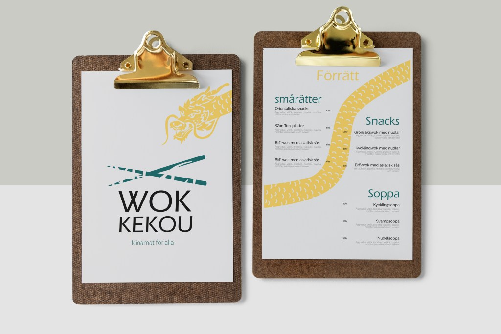
During my vocational college program, we were tasked with creating a menu, logo, and consumables for a restaurant. We were assigned a country and had to develop everything based on that.
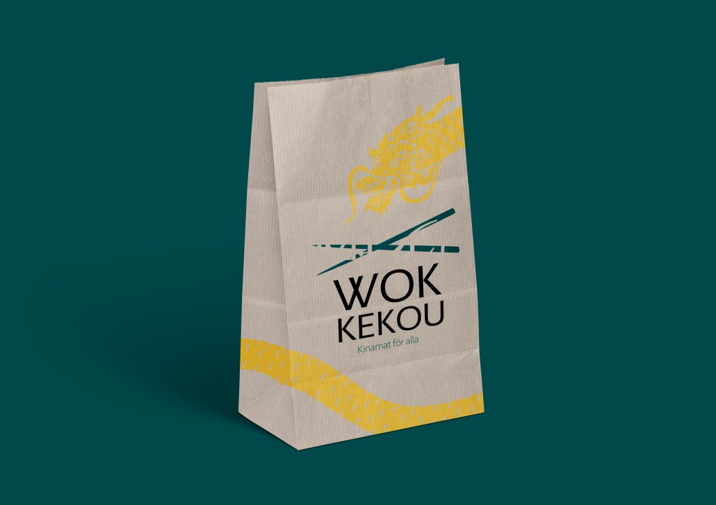
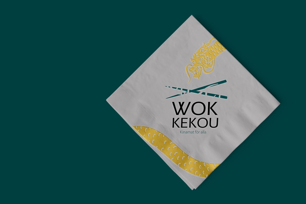
I chose to design for a family-friendly restaurant. I wanted to move away from the stereotypical red colors and instead drew inspiration from their magnificent dragons. This led to the use of a darker yellow and a darker turquoise. To make the menu playful, I incorporated the dragon so that its body stretches from the first page to the last.
The reason I chose the specific font for the logo was due to the way the ”W” intersects. It feels playful yet still serious and readable. ”Wok Kekou” is written in Chinese characters on the chopsticks above the logo.